dependencies section in the amd.json file. If package
has no dependencies then just specify an empty array.
amd.json
{
  "dependencies": {
    ...
    "libs/packageName.js": [
      { "name": "jquery", "param": "$", "global": "jQuery" },
      { "name": "px-bootstrap/transition", "param": "transition", "global": "Transition" }
    ],
    "libs/anotherPackage.js": []
  },
  ...
}
exports
section in the amd.json file:
amd.json
{
  ...
  "exports": {
    "libs/packageName.js": "PackageClassToExport"
  },
}
Full example:
bower.json
{
  ...
  "dependencies": {
    ...
    "FitText.js": "*"
  }
}
custom/custom.js
//= require ../libs/FitText.js/jquery.fittext.js
amd.json
{
  "dependencies": {
    ...
    "libs/jquery.fittext.js": [
      { "name": "jquery", "param": "jQuery", "global": "jQuery" }
    ]
  },
  ...
}
Now you can use FitText.js plugin with AMD:
require(['jquery', 'px-libs/jquery.fittext'], function($) {
  $('.responsive-text').fitText();
});
Creating custom colors
You can customize UI elements using custom color classes. To generate a
custom color just include the pixel-color-variant mixin in your SCSS code
using the next syntax:
@include pixel-color-variant(color-name, #bg-color, #text-color);
Let's take the example of color creation:
custom/scss/_colors.scss
@include pixel-color-variant(facebook, #3b5998, #fff);
custom/custom.scss
@import 'scss/colors';
The call above will generate the next classes:
.text-facebook.bg-facebook.bg-facebook.darken.bg-facebook.darker.border-facebook.label-facebook.btn-facebook.table-facebook.dropdown-menu-facebook.nav-facebook.alert-dark.alert-facebook.progress-bar-facebook.tooltip-facebook.popover-facebook.list-group-facebook.panel-group-facebook.switcher-facebook.custom-control-facebook.panel-dark.panel-facebook.panel-dark.panel-body-colorful.panel-facebook
Now, after the sources recompilation, you can change the style of an element by adding the appropriate class:
<button type="button" class="btn btn-facebook">...</button>

<ul class="dropdown-menu dropdown-menu-facebook">
  ...
</ul>

<div class="progress">
  <div class="progress-bar progress-bar-facebook"></div>
</div>

<label class="custom-control custom-checkbox custom-control-facebook">
  <input type="checkbox" class="custom-control-input">
  <span class="custom-control-indicator"></span>
  ...
</label>
Theming
You can easily create your own themes using built-in pixel-theme mixin.
To create theme:
- Create custom/scss/themes/theme-name/theme-name.scss file.
- Setup your theme colors using the
pixel-thememixin. - Compile SCSS sources. Compiled themes are placed into the dist/css/themes directory.
-
Include compiled theme file in the page's
<head>element:
<link href="path/to/assets/css/themes/theme-name.css" rel="stylesheet" type="text/css"> - Done!
Let's take the example of theme configuration:
custom/scss/themes/brand-blue/brand-blue.scss
// If you're creating a dark theme do not forget to import dark scheme variables

// @import '../../../../scss/variables-dark';
@import '../../../../scss/variables';
@import '../../../../libs/bootstrap-sass/assets/stylesheets/bootstrap/variables';
// @import '../../variables-dark';
@import '../../variables';
@import '../../../../libs/bootstrap-sass/assets/stylesheets/bootstrap/mixins';
@import '../../../../scss/mixins';


$theme-primary-color: #2383F4;


// Generate theme
//

@include pixel-theme(

  // Basic
  //

  $primary-color:        $theme-primary-color,             // Primary color
  $primary-text-color:   #fff,                             // Primary text color
  $primary-border-color: darken($theme-primary-color, 6%), // Primary border color

  $body-bg:              #f6f6f6,            // Body background
  $panel-border-color:   #e2e2e2,            // Border color of panel
  $header-bg:            transparent,        // [Optional] [Default: transparent] Background of page header
  $header-border-color:  rgba(0, 0, 0, .07), // [Optional] [Default: false] Border color of page header

  // Px-Navbar element
  //

  $px-navbar: (
    bg:                             $theme-primary-color,    // Navbar background
    border-color:                   rgba(0, 0, 0, .09),      // Border color of navbar item on md, lg and xl screens
    link-color:                     #fff,                    // Link color
    link-hover-color:               rgba(255, 255, 255, .8), // Link color in hover state
    link-hover-bg:                  rgba(0, 0, 0, .04),      // Link background in hover state
    shadow:                         "none",                  // [Optional] [Default: "none"] Navbar shadow

    // Navbar brand styling (take effect when .px-nav is expanded on lg and xl screens)
    brand-bg:                       $theme-primary-color, // Brand background
    brand-link-color:               #fff,                 // Brand link color
    brand-link-hover-color:         #fff,                 // Brand link color in hover state

    collapse-bg:                    #2578da,                  // [Optional] [Default: px-navbar[bg]] Background of navbar collapse on xs and sm screens; Background of dropdown menu on md, lg and xl screens
    collapse-border-color:          #216CC5,                  // Border color of navbar item on xs and sm screens; Border color of dropdown menu divider on md, lg and xl screens
    collapse-dropdown-bg:           rgba(255, 255, 255, .06), // Background of dropdown menu on xs and sm screens
    collapse-dropdown-border-color: #5898E3,                  // Border color of dropdown menu item on xs and sm screens

    form-control-bg:                rgba(255, 255, 255, .3), // Background of navbar form control
    form-control-border-color:      transparent,             // Border color of navbar form control
    form-control-color:             #fff,                    // Text color of navbar form control

    scrollbar-color:                rgba(255, 255, 255, .5), // Scrollbar color
    scrollbar-rail-color:           transparent,             // Scrollbar rail color

    enable-transitions:             false // [Optional] [Default: true] Enable transitions
  ),

  // Px-Nav element
  //

  $px-nav: (
    toggle-color:                #fff,    // Text color of toggler
    toggle-bg:                   #2977d3, // Background of toggler

    bg:                          #545d64,            // Nav background
    color:                       #aabcca,            // Text and link color
    link-hover-color:            #fff,               // Link color in hover state
    link-hover-bg:               rgba(0, 0, 0, .08), // Link background in hover state

    // Dropdowns
    dropdown-bg:                 #485056,              // Background of dropdown
    dropdown-menu-title-color:   #fff,                 // Text color of floating dropdown title
    dropdown-menu-title-bg:      $theme-primary-color, // Background of floating dropdown title

    // Active
    active-color:                #fff,                 // Text color of active nav item
    active-bg:                   #3687e6,              // Background of active nav item
    active-icon-color:           #fff,                 // Icon color of active nav item
    active-dropdown-icon-color:  $theme-primary-color, // [Optional] [Default: px-nav[active-icon-color]] Icon color of active nav dropdown

    scrollbar-color:             rgba(255, 255, 255, .3), // Scrollbar color
    scrollbar-rail-color:        transparent,             // Scrollbar rail color

    toggle-border-color:         #3372bc, // [Optional] [Default: false] Border color of toggler
    border-color:                false,   // [Optional] [Default: false] Border color of nav
    item-border-color:           #4D565C, // [Optional] [Default: false] Border color of nav item
    dropdown-item-border-color:  #41494E, // [Optional] [Default: false] Border color of dropdown item
    box-border-color:            #445059, // [Optional] [Default: transparent] Border color of .px-nav-box

    tooltip-bg:                  $theme-primary-color, // [Optional] [Default: px-nav[active-bg]] Background of tooltip
    tooltip-color:               #fff,                 // [Optional] [Default: px-nav[active-color]] Text color of tooltip

    dimmer-bg:                   rgba(#485056, .5), // [Optional] [Default: $px-nav-dimmer-bg] Background of dimmer

    animate-items:               true // [Optional] [Default: false] Add transitions to nav items
  ),

  // Px-Footer element
  //

  $px-footer: (
    color:            rgba(255, 255, 255, .5), // Text color
    bg:               #5d676f,                 // Background of footer

    link-color:       rgba(255, 255, 255, .6), // Link color
    link-hover-color: #fff,                    // Link color in hover state

    muted-color:      #939ea7, // [Optional] [Default: false] Text color of .text-muted element
    border-color:     false,   // [Optional] [Default: false] Border color of footer
    hr-color:         #6d7881  // [Optional] [Default: false] Border color of  element
  )
);

// Custom styles
//

// PxNavbar
@if mixin-exists(px-nav-theme) {
  @media (min-width: $screen-md-min) {
    .px-navbar .dropdown-menu {
      border: none;
    }
  }
}

// Pace.js
.pace-progress { background: darken($theme-primary-color, 13%); }
<html>
  <head>
    ...
    <link href="path/to/assets/css/themes/brand-blue.min.css" rel="stylesheet" type="text/css">
    ...
  </head>
  <body>
    ...
  </body>
</html>
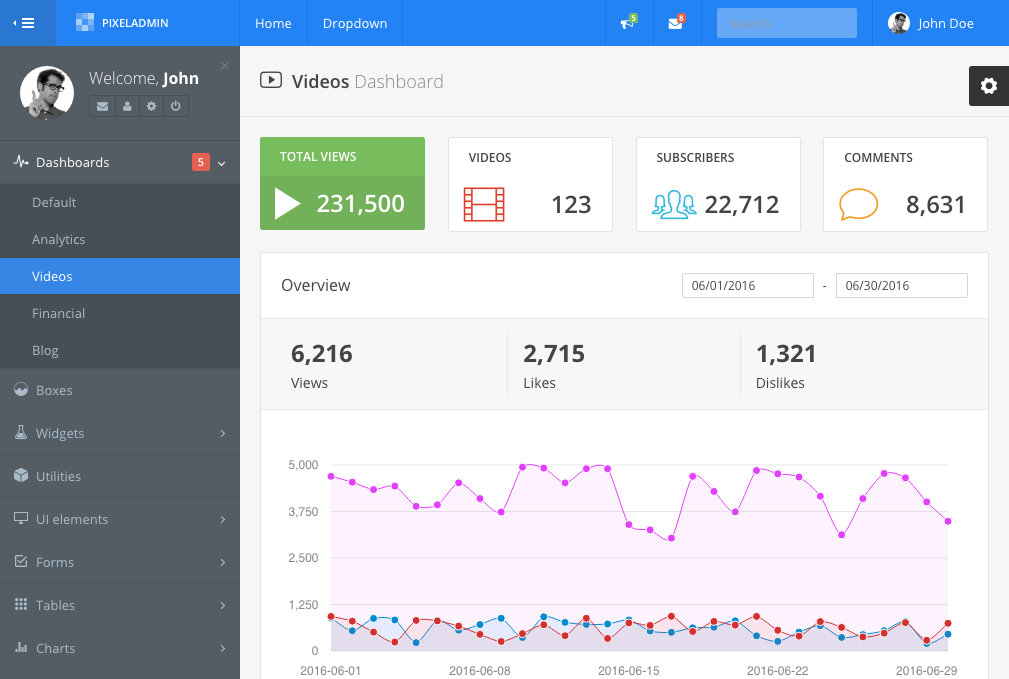
The result: